How to Fit All Inline Images Within the HTML Component in SuperMemo

Toolkit -> Options -> Go to “Fonts” tab -> Click “Stylesheet” button -> click “Edit” button at the bottom to open supermemo.css. Append the following css rule:
|
|
Save and you should see this result:

Introduction
If you import articles with images, chances are the images will be larger than the HTML component like this:

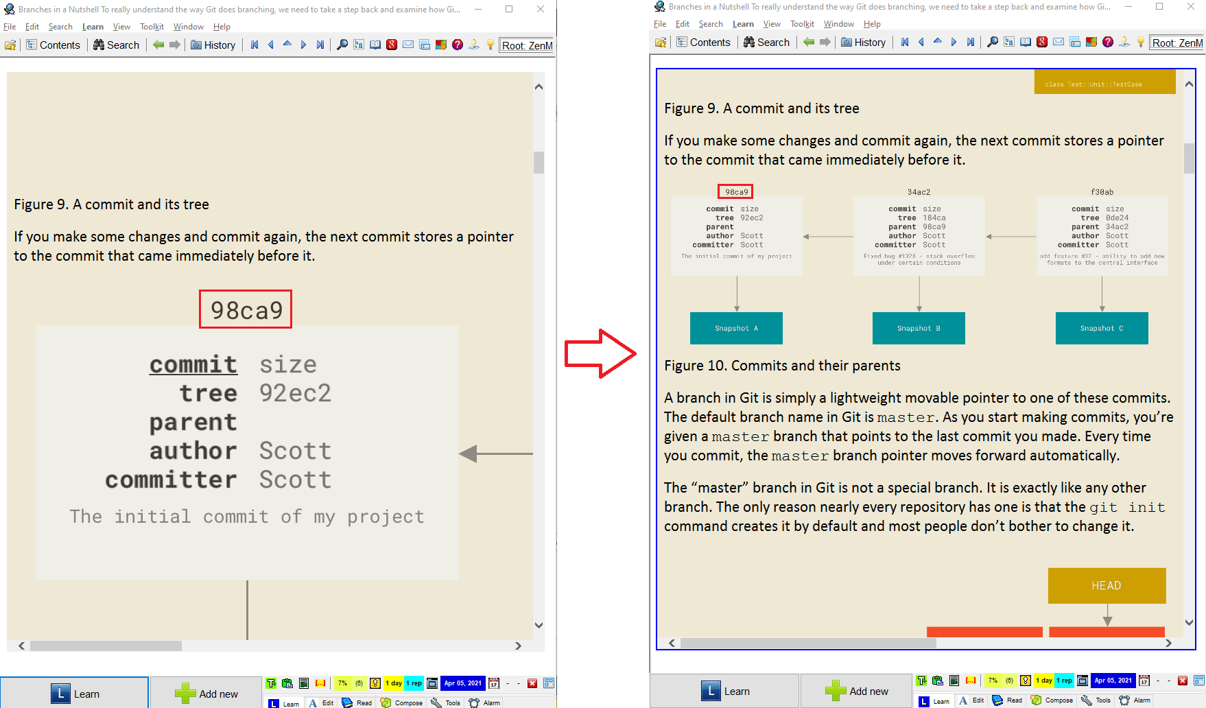
If I want to view the whole image, I have to scroll horizontally, or I can maximize SuperMemo like this:

Even then I can’t view it in its entirety. The resolution is 2223 x 1230px for this particular image. I should add that it’s not the fault of SuperMemo’s Internet Explorer (IE 8 (source)) because when I opened the HTML in Chrome or Firefox, they all displayed the same behavior. This is because I hadn’t specified the img css rule.
I used to just manually resize them one by one… like an idiot. Then one day I was reading Pro Git (source of the above images) which contains a lot of big images. I was fed up with having to resize them one by one and knew there must be a better way.
I figured I could open the HTML source (Ctrl+F6), copy all the HTML to a text editor, add inline-style css to all the img tags with find and replace: From <img src="file:///C:/Users/images/000057.png"> to <img style="width: 600px;" src="file:///C:/Users/images/000057.png">.
Then I realized I should do this globally, hence the above TL;DR solution. Now all the images will fit within the HTML component:

Not an entirely happy ending
width: 100% will be enlarged.Initially I’d set the following css rule:
|
|
max-width: 100% is better than width: 100%. For both declarations, if the image’s width is larger than 100% of the HTML’s component, both declarations will shrink the image to 100%. Problems occur when the image is smaller than the HTML’s component. With width: 100% however, when the image is smaller than the HTML’s component, it will stretch the image to the full width of the HTML component. Here’s what I mean in images:
Without width: 100%;:

With width: 100%;:

The image is scaled up to 100% of the HTML component’s width, making it blurry. I have no idea why because this issue doesn’t occur when I open it in different browsers. From left to right: SuperMemo’s IE8, Chrome Version 89, IE Version 20H2:

But using max-width: 100%; doesn’t work. After some googling it’s said to be an IE issue (if I understand correctly, IE is notorious with its lack of css support) and SuperMemo is using IE 8. The rendering engine behind all HTML components is IE 8. But hey I’m not complaining… I am
I tried this accepted solution but it didn’t seem to have any effect. Then I tried another accepted solution. But it broke my SuperMemo (it kept reloading and the UI was frozen) and I had to force close it:

Good enough
Setting width: 100%; is better than not setting any img rule because I have a lot of big images. If I ever come across a scaled-up image I’ll just manually resize it. If, for a particular article with a lot of small images, I’ll just open the source (Ctrl+F6), add inline-style css like style="width: 400px;" to override the global css rule.
Conclusion
I hope this tip is helpful. You don’t need to manually resize every image like I did from now on.
If you can make SuperMemo behave like the following:
|
|
Please let me know: send your solution to masterhowtolearn At gmail dot com, and I’ll update this article. Thank you!